top of page


2017
Maybe
You have been using the dating apps for a while but disliked them
Because
Or

You are very beautiful inside, but don't have good out-looking,
people on dating app don't want to open a conversation with you

You hope to put personality on a level playing field with physical appearances
Or

You find that the pressure of putting your face out there for the public to judge can be intimidating.
INTRODUCING

EXCITED ADVENTURE
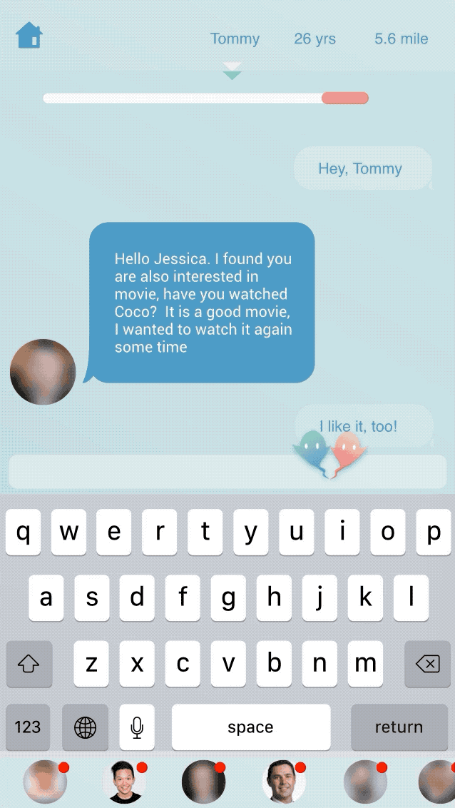
Once the user hits the "New" button, they will be randomly dragged to a chat room based on their preferences in their profile. It is a new adventure for them, and they will never know whom they gonna talk to.

90 SECONDS SHOWTIME!
The users will not see other people's profile image immediately but a blurry image, the blurry image becomes more and more cleary as the conversation goes on. This process will last 90 seconds. It is a good opportunity to let them know each other's inside better.
MUST USE REAL PHOTOS!
The users will not be able to upload their photos from their phone album. Instead, they need to take a selfie. Moreover, they need to retake selfies after no more than 30 days, to make sure other people know about what they look like most recently.


BECOME A BETTER CHATTER
When users register the account, as a part of the registration, they will choose five topics they are interested in. In the chat page, they can talk about the common interests or easily find the trigger to start a conversation.
FEEL COMFORTABLE TO END CONVERSATION
If they get bored during the 90 seconds and want to end the current conversation, they can click the floating ghost icon to be a ghost. Once they do it, they will be dragged to another chat room.


MORE SUCCESS FOR ONLINE DATING
If both sides want to continue the conversation, after 90 seconds, they will chat in a general chat room.
HIGHLIGHT FEATURES


90 seconds run very fast, and it is possible that users have several conversations at the same time. So there is a show bar at the bottom of the screen, they don't need to go back to their homepage to open different conversations.

Users can press and move the floating ghost icon to any place of the screen, just like a ghost, it could be anywhere.
SCREENS


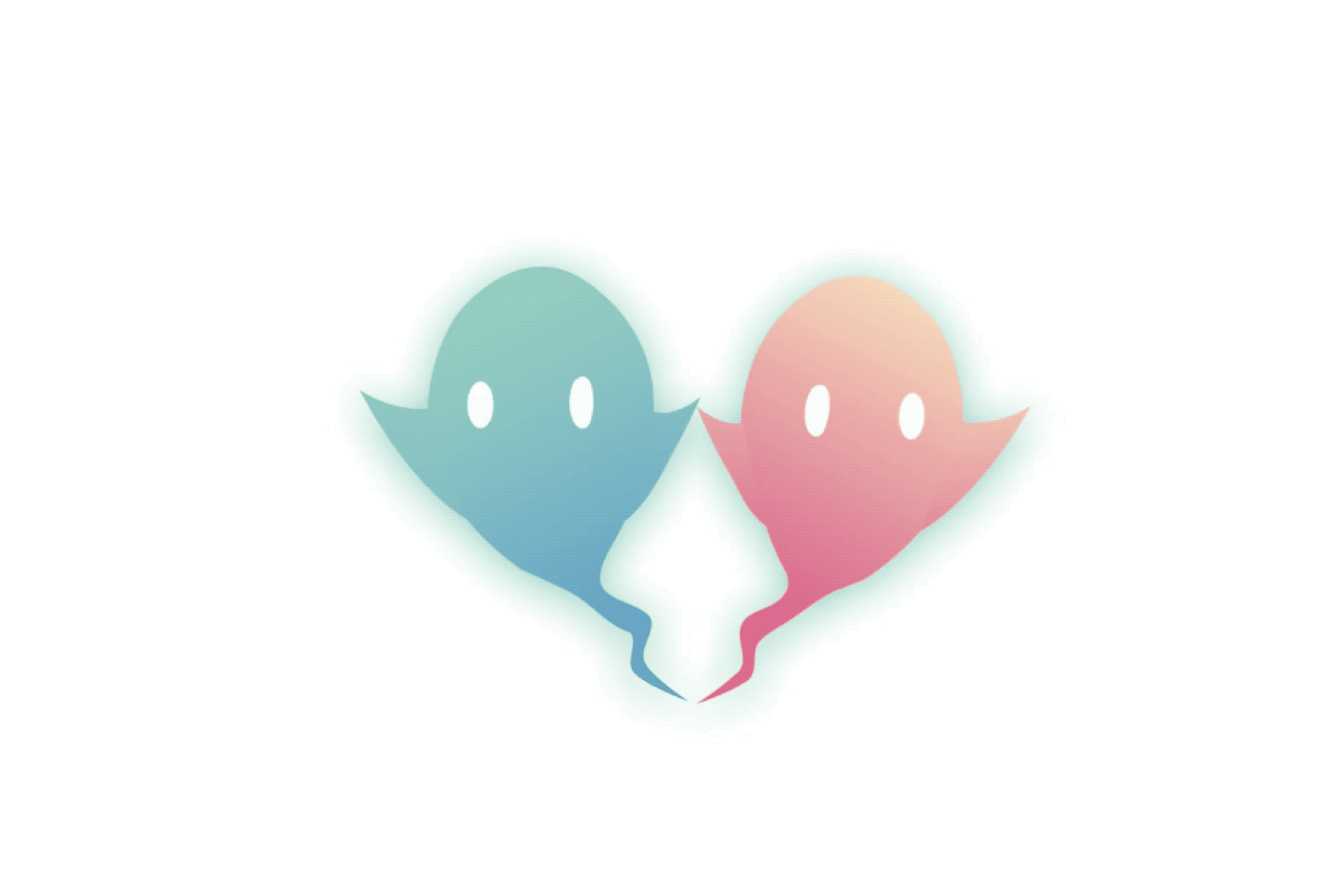
LOGO


The most important feature of Blindly is, if users want to leave a random chat room during the first 90 seconds, they can "be a ghost" and leave the chat room at any time.
The heart shape reminds people of love, relationship, romantic, etc. This logo combines the icons of "ghost" and "heart", which represents Blindly's product clearly. Two parts make the shape a complete heart means there are two parties in a relationship.
The typeface of "Blindly" is Billy Ohio.
UI KIT


Color Scheme
Typeface


DESIGN PROCESS
EVERYTHING STARTS WITH AN IDEA...
Everything starts with a simple idea from the two co-founders, Sam and Bobby. They want to create a dating app which is very different from the Tinder, Zoosk and other mainstream on the dating app market. We all know how Tinder works, people swipe left and right and only spend less than 1 second to decide if they want to talk to a person on the dating app or not. However, there are some other people not enjoying finding dating matches by physical appearance.
Key feature:
1 The profile image will be hidden until both of the two chatters agree to continue the conversation.
2 The users could ghost at any time if they want to end a conversation.
MY ROLE
As the first and only designer on the team, I closely collaborated with co-founders, PM and software engineers for app production and implement, iterated the features, did user research and usability testing. I was also responsible for logo design, presentation slides design and all other visual design.
Design tools: Sketch, InVision, GIF Brewery 3, Zeplin, Axure
DESIGN METHOD
I used the Double Diamond structure to understand customers and their problems and explore creative and innovative ways to solve their problems and delight them.
Using the double diamond, usually, there are two different types of thinking to approached problems and solutions: divergent and convergent.
-
Divergent thinking — think broadly, keep an open mind, consider anything and everything
-
Convergent thinking — think narrowly, bring back focus and identify one or two key problems and solutions

DIVERGENT
DIVERGENT
CONVERGENT
CONVERGENT
DISCOVER
The kick-off meeting
The kick-off meeting happens on the first day of the project. The whole project team comes together to define the project. 3 things to come out of this stage are: 1) why are we doing it? 2) who is it for? 3) what are the KPI’s? — oh and not to mention we make sure everyone is clear on his or her roles. Whilst everyone is in the same room this is also a great opportunity for people to share his or her expert opinions and ideas.
Mind map

Primary research
I sent out two surveys on Survey Monkey. The goal of the first survey is knowing about user needs about using a dating app. The second survey helped me know about user habits and preference when they use a dating app.
I got 55 responses for the first survey, and 47 responses for the second one.
02
01
Over 68% of interviewees think it is important to meet someone with similar interests in a date
76.5% of interviewees like to try a new dating app that isn’t “match then talk” (e.g., Tinder), but “talk then match"
03
73% of interviewees changed their social network profile images within one month
04
70% of interviewees take selfies 1-3 times a month
05
The biggest disappointments they have had with dating apps are fake profiles and no responses.
DEFINE
Scope down the user needs
01
They want to get quick responses.
02
They hope to see real profile images, ideally, the images are taken recently.
03
They want to find someone who has similar interests with themselves.
Persona


The design challenge
How to make the "ghost" process smooth and high efficiency?
I separated this challenge into small tasks. In a dating app, most of the users have the experience of being ghosted and ghost others. However, it is not a good experience for them because the messages are still there to remind them about the bad experience. So one of the tasks is making them feel comfortable about ghost others and being ghosted.
Another task is deciding the next step after ghosting.
IDEATION AND FLOW

WIREFRAMING
I like using a user flow chart to help myself organize the complete flow before I create a wireframe. A user flow chart is very clear and easy to draw and edit. It is also a good tool to let my co-workers who may not have the design background to understand.

THE FIRST ROUND USER TESTING
I did both internal and external user testing. The purpose of the user testing includes:
-Make sure the flow is smooth
-Know about user thoughts about the "ghost" idea
-Know about the length of time to let users have a conversation before see another chatter's profile image

“I like the topics recommendation feature, it makes the chatting easier. 6o seconds is too short for meaningful conversations. I also felt stressful to see the countdown. "
PROTOTYPE

Interactive prototype

SECOND ROUND USER TESTING
According to the first round user testing, several users mentioned they didn't like the green/pink color scheme. Therefore, I also did user testing to ask about their thoughts for the UI scheme and icons. Based on the user testing results, the first color scheme is their favorite.

01


02


03


04


05


REFINED PROTOTYPE

DELIVER
I used Zeplin to collaborate with software engineers. All of my designs are in pixel level so software engineers can download icons, know about the font size and icon size, etc.
We used Axure to manage project.


bottom of page